Before a customer reads your ingredient list, checks your brand story, or looks at reviews, they’ve already formed an opinion about your product. It happened in the first second they saw it — on a shelf, in a photo, or in someone else’s hands. That first impression comes entirely from the packaging.
This isn’t a superficial thing. It’s how the brain works. People use visual cues to make quick judgments about quality, price point, and whether a product is meant for them. Packaging communicates all of that before a single word is read.
What Packaging Actually Signals
Every design choice on a cosmetic package sends a message, whether you intend it to or not.
A heavy glass bottle with a matte finish says “premium, slow beauty, worth the price.” A lightweight plastic tube with a bright color palette says “fun, accessible, everyday use.” Minimal typography on a white background says “clean, clinical, science-backed.” Ornate patterns and gold detailing say “luxurious, indulgent, gift-worthy.”
None of these are better or worse — they’re just different conversations with different customers. The problem happens when the packaging says something different from what the brand intends. A high-quality serum in a cheap-looking bottle creates confusion. A budget-friendly toner in overly premium packaging sets expectations the product can’t meet.
Good packaging design aligns what the product is with what it looks like. When those two things match, trust happens faster.
The Shelf Problem
In a physical retail environment, a cosmetic product has roughly three seconds to catch a shopper’s eye before they move on. In that window, packaging has to do several things at once: stand out from the products next to it, communicate the product category clearly, and suggest the right price point for the shelf it’s sitting on.
That’s a lot to ask of a bottle.
The products that manage it aren’t necessarily the most elaborate designs. They’re often the most coherent ones — where the color, shape, material, and typography all work toward the same message. A product that tries to do too many things visually ends up doing none of them effectively.
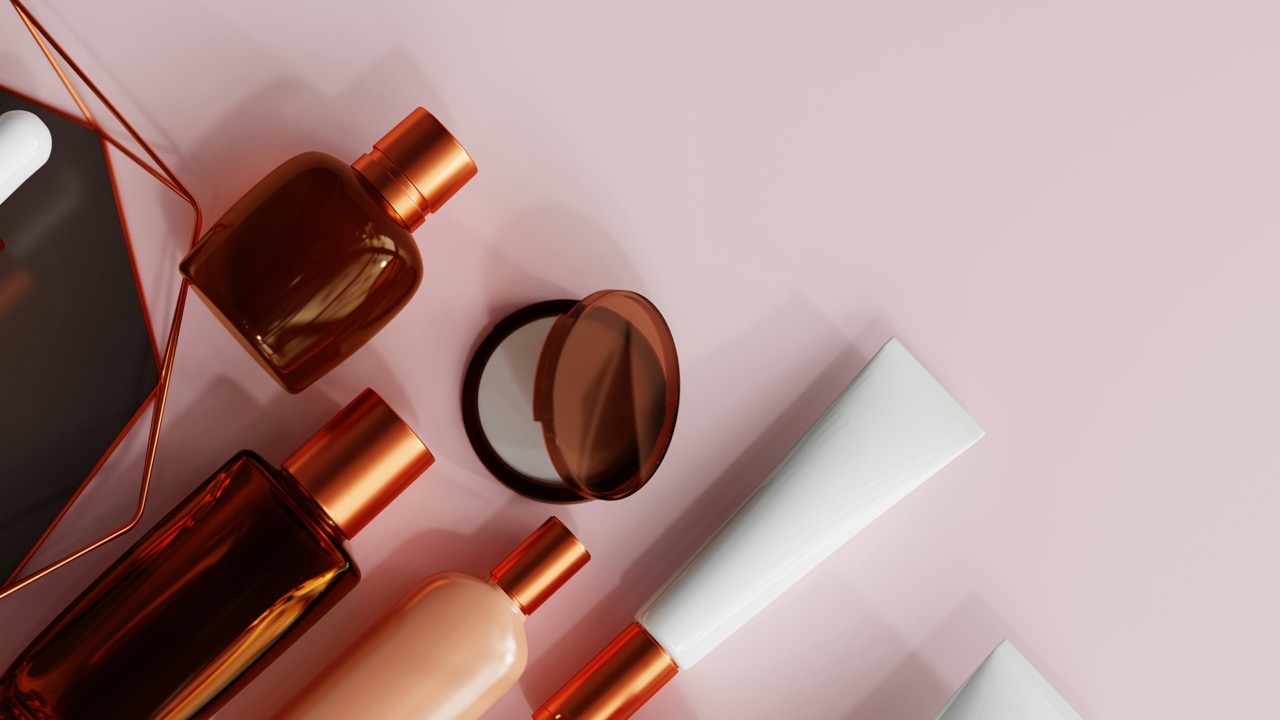
The same logic applies online, where packaging has to read clearly in a thumbnail-sized photo and look good enough to photograph well for user-generated content. Flat lay photos and unboxing videos have made the exterior of a product almost as important as what’s inside it.
Why Design Can’t Be an Afterthought
A lot of small beauty brands treat packaging as the last step — something to sort out once the formula is finalized and the brand name is chosen. This almost always causes problems.
Packaging affects the product, not just the other way around. Certain formulas require specific closure types to prevent oxidation. Certain ingredients aren’t compatible with certain plastics. Pumps, droppers, and airless dispensers all have different fill requirements and shelf stability implications. If these things are figured out late in the process, it often means expensive changes, delays, or compromises.
Working with cosmetic packaging design services early in the development process solves this. A packaging partner who understands both the design side and the manufacturing side can flag compatibility issues before they become expensive, suggest materials that work for the formula and the aesthetic, and build packaging that functions as well as it looks.
The Cost of Getting It Wrong
Bad packaging is expensive in ways that don’t always show up immediately.
The obvious cost is low conversion. Products that don’t catch the eye don’t get picked up, and products that aren’t picked up don’t get bought. But there are subtler costs too. Returns from customers who felt misled by packaging that didn’t match their expectations. Influencers who don’t feature a product because it doesn’t photograph well. Retailers who pass on stocking it because the shelf presence isn’t strong enough.
Redesigning packaging after launch is also significantly more expensive than getting it right the first time. You have to exhaust existing stock, redesign, retool molds if the structure changes, and reprint all materials that reference the old design. The sunk cost of bad packaging compounds over time.
What Good Packaging Design Actually Involves
Strong cosmetic packaging design isn’t just about picking a color and a font. It starts with understanding the brand — who the customer is, where the product will be sold, what the price point needs to communicate, and how the packaging will be used in real life.
From there, structural decisions come before visual ones. What format works for the formula? What closure type is most user-friendly? What size and weight is appropriate for the category? These choices shape everything that comes after.
The visual layer — color, typography, finish, print treatment — comes last. But it’s built on a structural foundation that already makes sense. When both layers are working together, the result is packaging that looks intentional because it is.
That alignment between function and appearance is what separates packaging that customers notice from packaging that customers remember.